I’ve been testing my app with fake data for a long time. I have a function that I call, and it 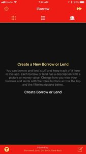 creates some people and items, populated with nice pictures from unsplash, and bingo presto I can work with them in my app.
(Nice thing about this data is that I’ll be using it to create screenshots for the app store.)
Which made making an empty view not so much of a priority. But getting down to the short strokes, I needed to show the user something when the app first started, because a blank screen just won’t cut it.
(Years ago I would have been, like, whatever.)
I didn’t want to spend a lot of time on this, so I decided to try DZNEmptyDataSet. It’s a framework for just this purpose – to create an special view for when there’s no data. It’s handy because it integrates pretty quickly. I still 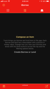 needed to do some work, like setting up the NSAttributedStrings that were needed. But pretty soon I got it up and running, as you can see in the first screenshot.
(And I have to say it looks pretty nice!)
But I ran into problems rather quickly. Two really. One, it would flicker sometimes as it was showing up. Which did not look good at all. Also, the three lines of text were not aligned properly in the middle of the view. Sometimes. Other times it did align properly. It was very frustrating and at that point I decided to roll my own solution.
(I don’t like third party library dependencies anyway.)
 Rolling my own solution using UITableView’s backgroundView actually took very little time. About the same amount of time as integrating DZNEmptyDataSet in the first place. Yikes. What took a lot more time was having it be context sensitive to whether there was no data at all, or if the data had just been filtered away by the user’s filter choices. (It was a little tricky because that information wasn’t anywhere near the same level in the code as was the empty view code.)
(And this was work I would have had to do anyway with DZNEmptyDataSet.)
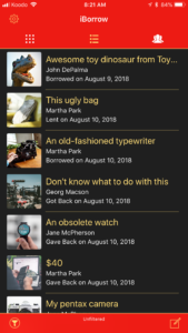
But I got something working, so here are two screenshots of my own empty view, without using DZNEmptyDataSet. I could re-use my code for creating the NSAttributedStrings, so that was handy. Also, you can see that I changed the text a little. I wish I had a copywriter in the family, I’m still not completely happy with it.
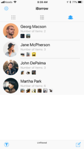
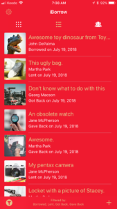
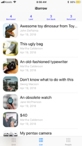
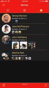 so many small little bugs, it’s amazing. Almost all of them are in the People view. See the image for a quick reminder of what the People view looks like.
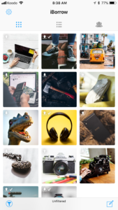

 particular sequence of actions, then enable a debug mode. This is really handy and I highly recommend it. I’ve used it in the past to allow me to email myself a log of everything the user has done in the app, which helps me debug problems.
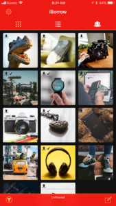
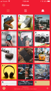
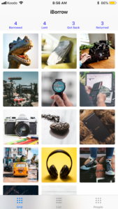
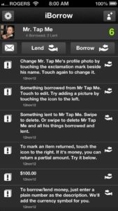
 I’ve already been working on the app, and you can see a screenshot here to the right. (The images are all from unsplash.com.) You can filter by things you’ve borrowed, lent, gotten back, and/or returned.